
What is the Kagi chart, and how does it work?
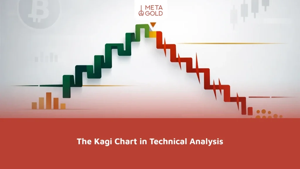
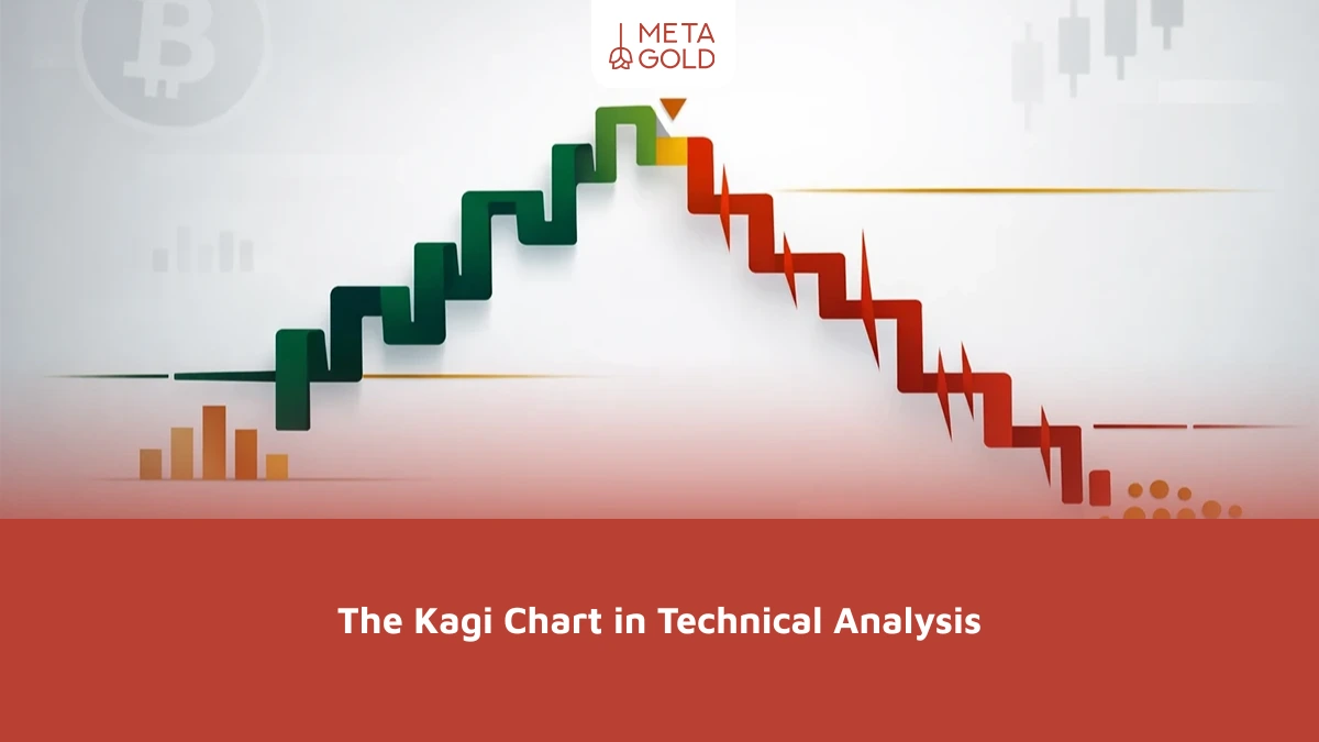
A Kagi chart is a type of price chart used in technical analysis that relies on price movement rather than time. It consists of vertical lines connected by short horizontal lines, with changes determined by price movement and a predefined reversal value. The name “Kagi” comes from a Japanese term historically associated with a tool used in woodblock printing to align paper; The name “Kagi” comes from a Japanese term historically associated with a tool used in woodblock printing to align paper.
The Kagi chart aims to filter out market noise and minor price fluctuations, focusing instead on the most significant trends and price movements. By ignoring minor, insignificant fluctuations, traders can gain a clearer picture of the overall market trend and its strengths and weaknesses.
What are the main components of the Kagi method?
The structure of a Kagi chart consists of two main types of lines:
- Thick lines: These appear when the Kagi line breaks above a previous high, indicating increasing buying pressure.
- Thin lines: These appear when the Kagi line breaks below a previous low, indicating increasing selling pressure.
Buy and sell signals on the Kagi chart are based on changes in line thickness
Changes in the thickness and color of the lines on a Kagi chart are among the most important factors used in interpreting trading signals. These changes indicate potential turning points in the market trend.
- The Kagi line changes from thin to thick: This may be considered a potential buy signal, especially if it occurs after a breakout above a previous high and is confirmed by other analytical tools. When the Kagi line changes from thin to thick, it means that selling pressure is beginning to subside and buyers are becoming more influential in price movement. This may indicate the start of an uptrend, but you should not rely on this signal alone without additional confirmation.
- The Kagi line shifts from thick to thin: This may be considered a potential sell signal, especially if it occurs after a break below a previous low and coincides with a clear weakening of momentum. When the line shifts from thick to thin, it indicates a decline in buyer strength and an increase in the sellers’ influence on price movement. This may signal the start of a downtrend, though the signal should be confirmed with additional analytical tools and clear risk management.
- Alternating thin and thick lines: If thin and thick lines appear alternately at short intervals, this indicates market uncertainty and a balance between supply and demand. In such a situation, the market is volatile, and traders should exercise caution.
What is the purpose of the Kagi chart in technical analysis?
The Kagi chart is used in many technical analysis applications because of its focus on trends and its ability to filter out market noise:
1. Identifying Strong and Sustainable Trends
One of the most important advantages of the Kagi chart is its ability to clearly display strong market trends. Long upward Kagi lines with increased thickness may indicate a strong uptrend, while long downward lines may indicate a strong downtrend. This feature helps traders trade in the direction of the primary market trend and avoid trading against it.
2. Reduce market noise and focus on key information
Financial markets are constantly subject to minor, inconsequential fluctuations that can mislead analysts. The Kagi chart helps reduce market noise by ignoring small price movements that do not exceed a predetermined reversal value. This allows traders to focus on more significant price movements and make more informed decisions.
3. Identifying Key Support and Resistance Levels
Although the Kagi chart does not directly show support and resistance levels as traditional charts do, the peaks and troughs formed by the Kagi lines are considered important points for identifying these levels. Any sudden change in the direction of the lines—especially at the locations of these peaks and troughs—can indicate the significance of those price levels.
A Comparison of Kagi Charts with Other Types of Charts
To better understand the Kagi chart, it is helpful to compare it with other types of charts:
- Line chart: The simplest type of chart, showing only the closing price over time. The Kagi chart, on the other hand, focuses on significant price movements rather than showing every price change over time.
- Japanese candlestick chart: Displays price information for the opening and closing prices, as well as the high and low prices, over a specific time period. The Kagi chart, on the other hand, omits many of the details found in a Japanese candlestick chart and focuses more on the overall trend of price movement.
- Bar chart: Similar to a candlestick chart, it displays information about the opening and closing prices, as well as the high and low prices, but has a different structure.
- Point-and-Figure Chart: It is similar to the Kagi chart in that it does not rely directly on time and focuses on price changes, but it differs from it in its construction and visual representation. Some traders prefer to use the Kagi chart because of its simplicity and its ability to visually represent trends more clearly.
- Renko Chart: Similar to the Kagi chart in that it reduces market noise and relies on specific price changes rather than the time factor. The Kagi chart provides a different perspective on trends through changes in line direction and thickness.
- Line Break Chart: It is similar to the Kagi and Renko charts in that it focuses on price movement rather than time, but it uses a different structure to display breakouts and trend continuity.
Comparison Table: The Kagi Chart vs. Other Charts
| Feature | Kagi Chart | Japanese Candlestick Chart | Point-and-Figure Chart |
|---|---|---|---|
| Main Focus | Price trends and trend strength | Price fluctuations over a specific time period | Price trends and breakout levels |
| Time Consideration | No | Yes | No |
| Complexity | Simple | Moderate | Moderate |
| Signal Display | Changes in line thickness/color | Candlestick patterns and price levels | X and O patterns, breakout levels |
| Applications | Identifying strong trends and reducing market noise | Detailed analysis of price fluctuations and chart patterns | Identifying trends and key support/resistance levels |
How to Draw a Kagi Chart and Calculate the Reversal Value
The method for drawing a Kagi chart may seem complicated at first, but it becomes clearer once you understand the reversal value—the minimum price movement required for the chart to change direction or draw a new line. This value can be defined based on a number of price points or units, as a percentage of the price, or according to the settings of the platform being used.
Steps for Drawing a Kagi Chart
- Set the reversal value: First, choose the amount of price movement required for the Kagi chart to change direction.
- Draw the first line: Start with the first price recorded on the platform—which is usually the closing price—and then draw a vertical line in the direction of the price movement. If the price continues in the same direction, the line continues to extend, and the thickness of the initial line is determined by the chart settings.
- Continuation of the Trend: If the price moves in the direction of the current line, the line continues to extend in the same direction.
- Identifying a Reversal: When the price moves in the opposite direction by an amount equal to or greater than the specified reversal value, the chart draws a short horizontal line connecting the previous trend to the new trend, then starts a new vertical line in the opposite direction.
- Changing the thickness: The line’s thickness changes when the price breaks through a previous high or breaks below a previous low; the line becomes thicker when upward momentum is strong, and thinner when selling pressure increases.
Limitations of the Kagi method
Despite its many advantages, the Kagi chart, like any other analytical tool, has some limitations:
- Ignore the time
- Inaccuracy in the Display of Fluctuations
- The need to adjust the reversal value based on the market and the financial asset being analyzed.
- Trading volume not displayed
In which markets and under what conditions is the Kagi chart useful?
Despite its limitations, the Kagi method may be useful in some cases:
- Identifying Strong Trends: Ideal for markets that tend to move in a specific direction
- Clearer entry and exit signals: The Kagi chart helps clarify trend changes, but the signal may sometimes be delayed depending on the reversal value used.
- Use with Other Tools: To increase the reliability of the signals, it is best to use them in conjunction with volume indicators, moving averages, or other price patterns.
- Applications in Various Markets: It can be used in stock, cryptocurrency, and commodity markets that experience significant price volatility.
Common Trading Strategies Using Kagi Charts
Using the Kagi chart helps in developing a variety of trading strategies. Here are some examples:
1. Kagi Line Thickness Change Strategy
- Entering a Long Position : A potential buy signal appears when the Kagi line changes from thin to thick after the change in line thickness.
- Entering a Short Position : A potential sell signal appears when the Kagi line changes from thick to thin after breaking below a previous low. A trader can enter a short position at this point.
- Stop-Loss: For buy trades, the stop-loss is placed below the lowest level (low) that occurred before the change in line thickness. For sell trades, the stop-loss is placed above the highest level (high) that occurred before the change in line thickness.
2. A trend-following strategy using highs and lows
- Confirmation of an Uptrend: When a Kagi chart shows a series of higher highs and higher lows, this may indicate the strength of the uptrend. Traders can look for buying opportunities in these situations.
- Confirmation of a downtrend: When a Kagi chart shows a series of lower highs and lower lows, this may indicate the strength of the downtrend. Traders can look for selling opportunities in this situation.
3. Combining with Indicators
To increase the accuracy of the signals, the Kagi chart can be combined with other indicators:
- Relative Strength Index (RSI) or Moving Average Convergence Divergence (MACD): These two indicators can be used to confirm the strength of a trend or identify instances of divergence. For example, if a buy signal appears on a Kagi chart and the Relative Strength Index is above 50, this may reinforce the signal’s reliability, though it does not eliminate the need for risk management.
- Trading Volume: If possible, monitor trading volume alongside the Kagi chart. An increase in trading volume when the thin line turns into a thick one reinforces the buy signal.
Summary of the Kagi chart
The Kagi chart is a useful tool in technical analysis, as it helps traders see market trends more clearly by focusing on significant price changes and filtering out minor fluctuations. Changes in the thickness of the lines on this chart can indicate shifts in the strength of buyers and sellers, making it an effective tool for identifying trends and finding appropriate entry and exit points.
However, relying solely on the Kagi chart is not enough for making trading decisions. It yields the best results in markets with clear trends, and for greater accuracy, it is recommended to use it in conjunction with other tools such as the Relative Strength Index (RSI), the Moving Average Convergence Divergence (MACD), trading volume, and risk management. For traders who prefer a simplified view of price trends, the Kagi chart can be a useful analytical tool.